

The New Broncos logo meaning sits at the centre of a major identity update arriving just a year after Brisbane completed a landmark NRL/NWL premiership double. This makeover marks the club’s most significant visual overhaul in more than two decades, timed with the city’s lead-up to the Brisbane 2032 Olympics and a rapidly shifting rugby league landscape.
Interest surged early when an unexpected IP Australia filing leaked the logo months before launch, forcing Brisbane to manage public discussion earlier than planned. As the 2026 season approaches, the club’s branding reboot aims to balance heritage with global ambition.
How the Rebrand Started & New Broncos Logo Meaning — Key Points Table
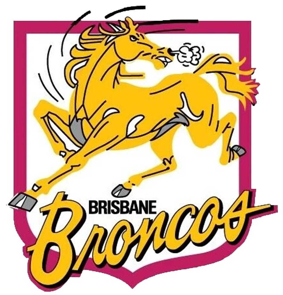
The rebrand’s origins go back to an accidental trademark leak discovered by journalists, prompting social chatter long before the Broncos were ready to front the change. It revealed a forward-facing horse badge that looked nothing like previous iterations. Internally, the club continued with an 18-month strategic design process guided by DDB Group, the global agency behind major sporting rebrands including Juventus.
Consultation sessions involved players, staff, sponsors and selected fan groups. Brisbane also considered Olympic-era city branding, ensuring its identity matched the city’s evolving profile as an international sports hub.
New Broncos Logo Meaning — Key Points Table
| Element | Explanation |
|---|---|
| Forward-facing horse | Symbolises momentum, aggression and modernity — replacing the long-standing side profile. |
| Shield shape | References the club’s 1988 foundation and early visual identity. |
| Central line | Represents the Brisbane River cutting through the heart of the city. |
| “Brisbane” wordmark | First time the club prioritises city identity over the “Broncos” name. |
| Minimalist styling | Follows global sport trends toward simple, scalable, modern marks. |
The combination of old and new reflects a club determined to evolve while still grounding its visuals in recognisable Queensland themes.
New Broncos Logo Meaning in Practice, Updated Jerseys & the ‘We Charge On’ Direction
The shift to a front-facing horse is intended to modernise the emblem while creating a brand that scales easily across digital platforms. Some design cues resemble global identities like Inter Miami or even AFL clubs adopting stripped-back styles.
Why “Broncos” Was Removed
The club outlined a clear rationale:
- A city-first identity to strengthen Brisbane’s presence ahead of the Olympics
- A simplified badge for international recognition, especially during NRL expansion pushes
- A strategy to maintain geographic relevance amid the Dolphins’ growth in Queensland
Criticism came from former players and fans who felt the removal of “Broncos” disconnects the logo from its iconic history. Supporters in favour argued the new design appears cleaner and better suited to the modern sports marketplace.
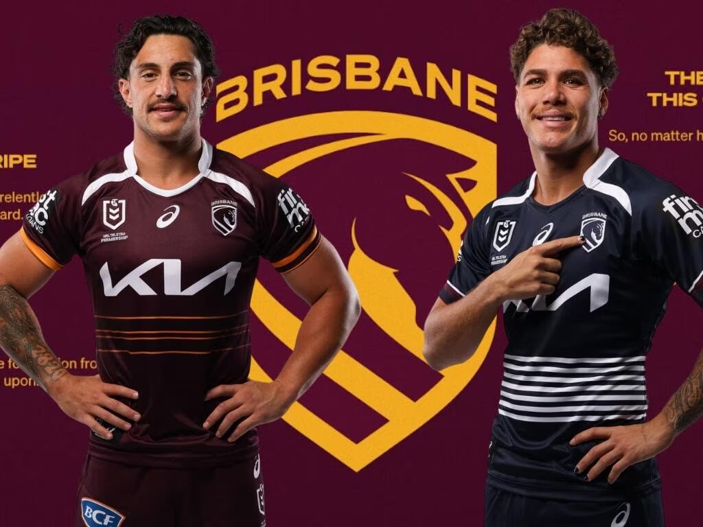
2026 Jerseys
The new kit lineup reflects both innovation and tribute:
- Home strip: streamlined maroon-and-gold layout with sharper contour lines
- Away jersey: midnight/navy Cyril Connell homage, connecting present-day Brisbane to Queensland’s grassroots talent pathways
- Subtle heritage trims: stitching and colour accents referencing the club’s early-state identity
Retail partners noted strong early merchandise interest, though traditionalists remain vocal about missing visual DNA from earlier eras.
Fan & Media Response: Praise, Pushback and Everything in Between
Reactions across the NRL community were mixed — typical of any major sporting rebrand. Online conversation ranged from enthusiasm for the cleaner badge to frustration at the departure from classic imagery.
Positive impressions:
- Modern, global-friendly look
- Clearer city-aligned branding
- Better digital scaling for streaming, apps and broadcast graphics
Critical feedback:
- Concerns about the absence of “Broncos”
- Apprehension that the logo feels corporate
- Nostalgia for the sharper, side-profile horse silhouette
Example: Some supporters pointed to Juventus’ transformation as proof that bold branding can pay off long term; others cited the New Zealand Warriors’ past logo changes as a warning that not all redesigns resonate immediately.
The financial side also drew discussion, with the reported $300,000 cost prompting debate about value. Compared to global sports markets, however, the expense is modest for a flagship NRL brand.
Conclusion: A New Era Taking Shape Through Design, Tradition and Modern Identity – New Broncos logo meaning
The 2026 Brisbane rebrand marks a decisive step forward, blending modern design with historic cues and city-first messaging. From the Cyril Connell tribute jersey to the forward-facing emblem and “We Charge On” theme, the club is steering confidently into a decade shaped by the 2032 Olympics and the NRL’s expanding global footprint.
Despite debate — and there will always be debate around club identity — the New Broncos logo meaning signals a clearer intention: Brisbane wants to be seen not just as a rugby league team, but as one of the city’s defining sporting symbols moving into the next era.


